Illustrator: Mae Besom

Client List

  • Pearson Education
  • Compendium Inc
  • Random House
  • Guideposts
  • Usborne Publishing
  • Orchard School District
  • Nursery World
http://www.illustrationweb.us/artists/MaeBesom/view


Project 2: Editorial Illustration

Creative Brief: 
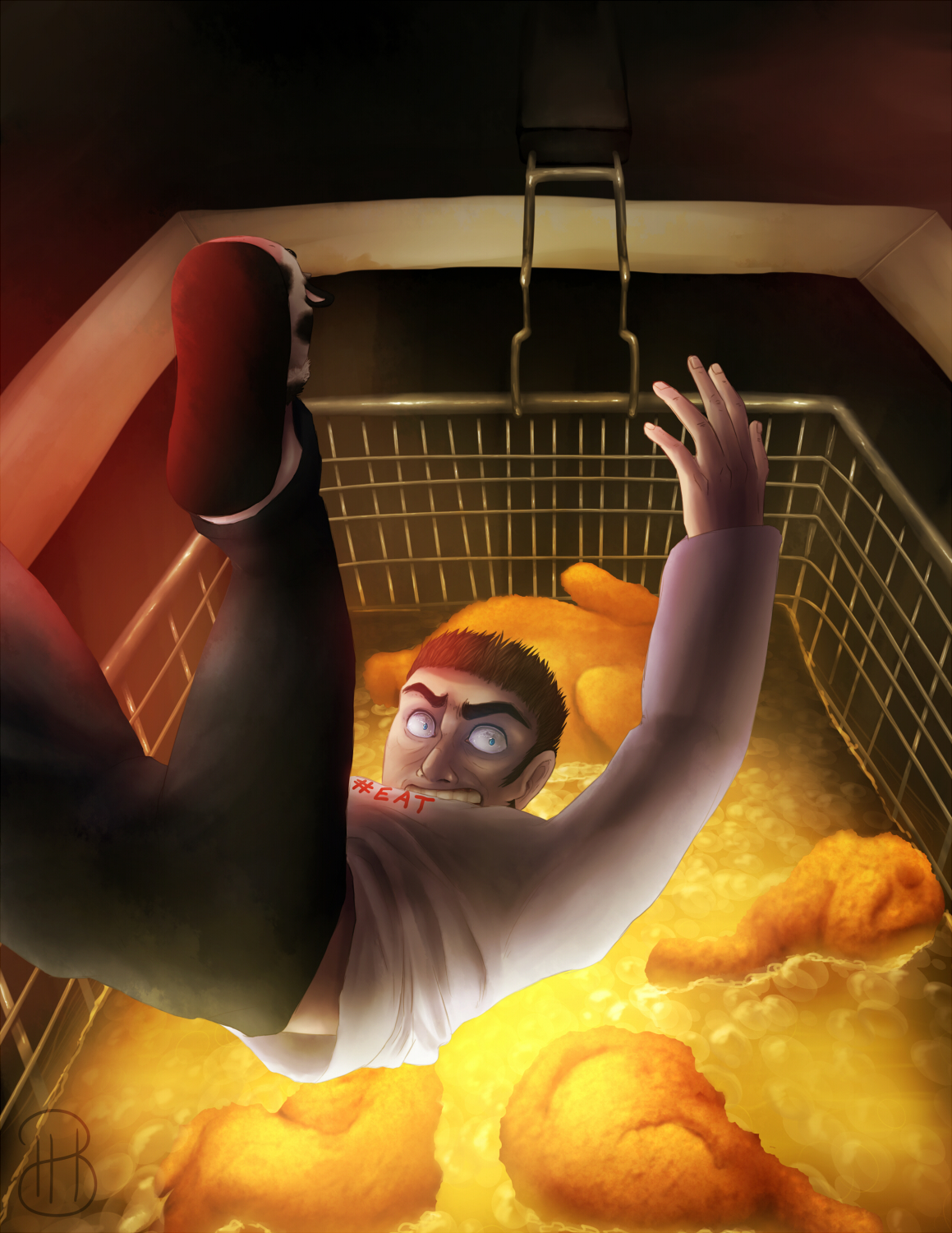
 Project Description:  ( Create a piece to the theme of "Top of the food chain" to show off personal style to a "mock" client. ) Show how far humanity has come when it comes to hunting and eating, and how it's isn't completely a great thing, as we seem to fry everything we get our hands on and how unhealthy is has become.  We are sacrifices for our food, in a way.

Client: FoodUs Good Magazine

Message: ("When it comes to killing, deep-frying, and eating, man really has conquered it all.") "What's next on the list to hunt and fry?"

Audience:  People who wish to be healthier.

Purpose/Objectives: (To establish the importance of "style" in the competitive market place.  So really show everyone your personal style, the style you want to make known as YOU, and present it in the project.)  Make a piece to work alongside the article "#EAT" to help grab attention for the article.

Specifications:
  Time:  2 Weeks.
  Size: 8.5x11 Vertical
  Known Deadlines:
     First Class:  Creative Brief and co., Thumbnails, mockups
     Week 1: Mid Project Consultation with Professor/Work Week.
     Week 2:  Final Class Critique and student presentations
  Budget: $500


Word List:

Fried Food
Throne
King
Royalty
Fat
Nasty
Lazy
Hunting
Animal Bodies
Trophies
Couch Potato
Slouch
Beer
BBQ

Mood Board


Thumbnail Ideas

Picked Three Thumbnails and did Roughs

 
Still playing around with a "title/header."  I do like "Next in line please" with a subhead of "May I take your order?"  Or something similar to that.   Anyways, here is my "tight" illustration.  I hope the next assignment isn't as ... "morbid."  I promise I don't only draw "scary" images, haha.

Final WIP.  I pretty much got the background nailed down.  I'm pondering if putting in the people in the deep fryer or not, now that the fryer is smaller and the people wouldn't have the detail I initially wanted them to show.

 The finished piece.

 I did some readjusting, and moved the whole composition downward.

My Style: Enhanced Selection

Alrighty.  Welcome to a giant splatter of things I've done/made.  Some of these are old, or older.  Nothing is more than 2 years old, I believe.

The first two are WIPs of something I was hoping to have finished before class, but alas... homework comes first, haha.  The rest after these first two are older from a couple weeks to 2 years.


Now, continuing with only digital:

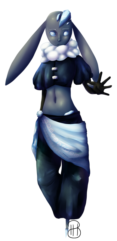
Here's my somewhat typical style.  It's a personal style I'm trying to improve constantly to how I want it to end up being.


Now these are a simplistic digital works:


Now these are my experimental/practicing digital painting:


These are a combination of digital and traditional:


And then these are traditionally made completely:


I wish I could just pick a lot more things, haha.  Sorry for tossing so much up here.  I felt it was better than trying to pick and choose (which I picked these out of a LOT).

(Yay, now you got to see how nerdy I am.)

Reading 2


My Illustration Style


(The first three examples are the most recent)
This is my typical style, (though it flexes now and then and right now the way I draw faces is changing a little bit again).


I have been exploring with digital painting.


However, for the turkey project, I want to do a style that is more minimal colors and bold lines.  I feel it will help it make it feel dramatic and to get the best quality for a newsprint.


Something like (and funny enough have a lot of red):


I also do pixel art, and photography.